

Charity
Mery & Alber
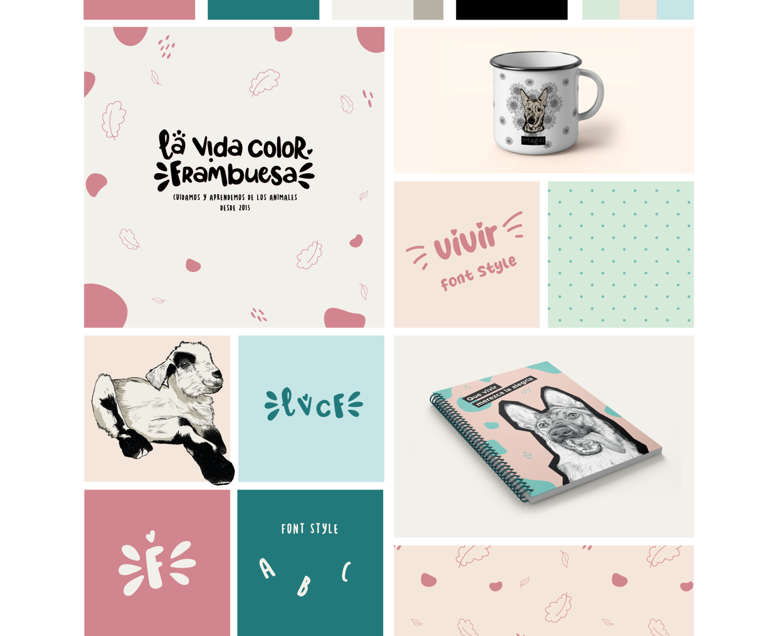
As projects evolve and strategies are refined, the necessity for a logo redesign becomes evident. This was the case for La Vida Color Frambuesa, an animal sanctuary I've been collaborating with since 2018. Witnessing its growth and shift towards online workshops and educational programs underscored the need for a logo that reflects its new direction.
A primary focus of the redesign was to overcome the original logo’s limitations, particularly its unsuitability for textile printing, since it was initially conceived for digital media use. Before embarking on the redesign, we refined the sanctuary's messaging and tested new graphics on social media and merchandise such as calendars and agendas.
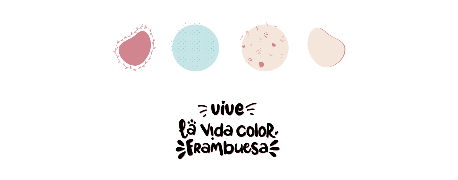
After these new concepts were well-received, we embarked on the logo redesign. Inspired by the sanctuary’s significant hen population, we introduced a minimalist variant of the logo, shaped to evoke a hen's silhouette. This adaptation was met with enthusiasm and has since become a symbol for the sanctuary across multiple platforms.
The revised logo is not only simpler and more adaptable but also more cost-effective to produce, enhancing the NGO’s profit margins.
In essence, the redesigned logo offers a renewed vision that naturally blends with the sanctuary’s established identity, echoing the sentiment of our community: "It seems like it has always been there."
Visit the website

